Obeo forges ahead into 2016 and will continue to do so for a long time to come

Etienne and myself want to take this opportunity to wish you our very best for 2016, and not because this is a New Year tradition but because we really, truly wish you a 2016, full of daring, creativity, success, and teamwork.
We are convinced that 2016 is going to be a renaissance year. Since Obeo’s official launch on 23rd November 2005, so many of you as collaborators, partners, and clients have taken part in our journey. It has been a real honour and a daily commitment to have won your trust.
With collaboration as central to our ethos, Obeo is now a leader in open source modeling technologies that are being used worldwide. More than 50 of us currently belong to the Obeo family in Nantes, Paris, and Toulouse, and Obeo is now represented in Germany and Canada.
The past ten years has also been about Obeo fulfilling collaborative stories such as with Thales, Ericsson, Airbus, the European Space Agency, the CNAV, the Pôle Emploi, EDF, the Ministry of Defense…
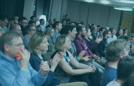
On 20 January 2016 we all got together to celebrate our tenth birthday right beside the superb Carrousel des Mondes Marins at Nantes with the magnificent 19th century ship the Belem anchored nearby. The evening mirrored who we are at Obeo i.e. convivial, creative, suprising. As you can see, the #WeAreObeo spirit infiltrated each and every one of us. :)!
Discover in pictures the Obeo's tenth anniversary party!
Ten years is an opportune moment to write a new chapter in the Obeo story. A logo is more than an image, it is an identity and our logo needed a revamp to take us into the next chapter of our story.

Obeo grew up with this logo and we were very attached to it because it led the way for us over our first ten years.
But what better than writing our new chapter with a new visual identity, a new logo!
Beyond mulling over colors and styles, together with the Nobilito agency we thought long and hard about the type of logo that would match what Obeo stands for and has evolved into: a company on a human scale, which as a result of its unflagging commitment to open-innovation, is successfully performing in the arena along with the big names.
And… Voilà… here it is!!!

We hope you like it as much as we do!
One of the goals of the new logo was to make it easier to read and recognize. The full name is spelt out in capital letters using a sans serif and slightly rounded font that was specially designed just for us.
Even if in general, changing a logo is synonymous with much internal discussion and debate, choosing the color for our logo was very simple because we all like green. Green is who we are and it sets us apart from most of the other IT companies. So we decided to keep to green but as you have probably noticed we added a touch of elegance by subtly mixing dark green with blue!
We are a company where innovation is an ongoing and shared process. We remain committed to Open-Source, which concerns most of the technologies we invest in, including Eclipse Sirius. We could not miss out on visually representing this openness value via the shape of our logo’s pictogram!
Movement is also part of our DNA: in Latin Obeo means ‘moving forward’. The old logo symbolized this forward momentum by a rounded arrow. The arrow has now made way for the new logo’s dominant color to move through four nuanced segments.
In this way the shapes in the new logo evoke a system that is in full and perpetual development…. mirroring the complex systems that our clients conceive of with the aid of our modeling solutions.
Last but certainly not least we wanted our logo to retain its cherished human dimension and what better than to add a warm sparkling note of orange!
With our new logo we humbly and sincerely acknowledge our journey and our successes. Maturity, creativity, vitality, and …. continuity!
So there you have it. Ten years have passed and we continue to look resolutely forward towards the future!
Etienne and Stéphane


